Advanced Search
Search

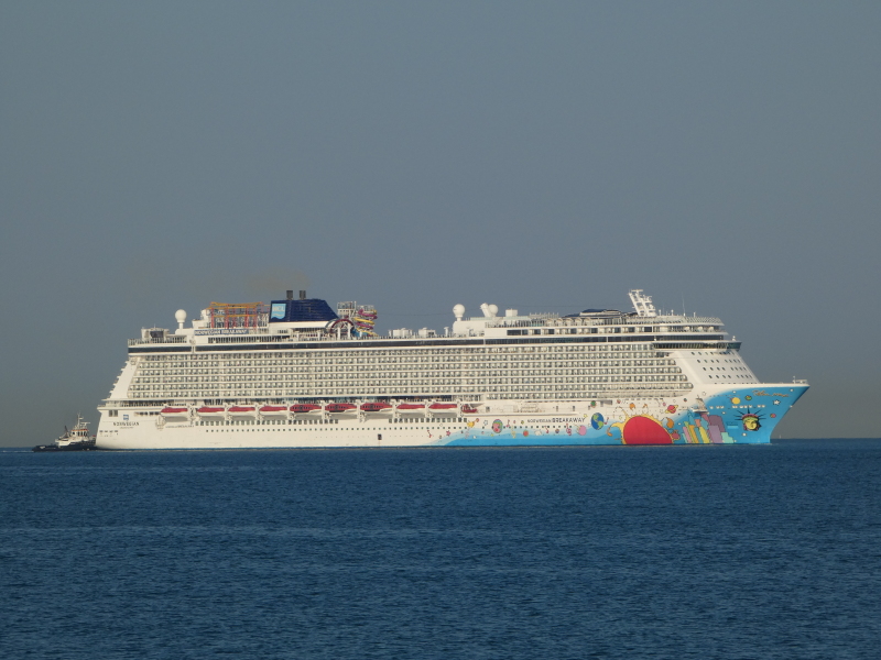
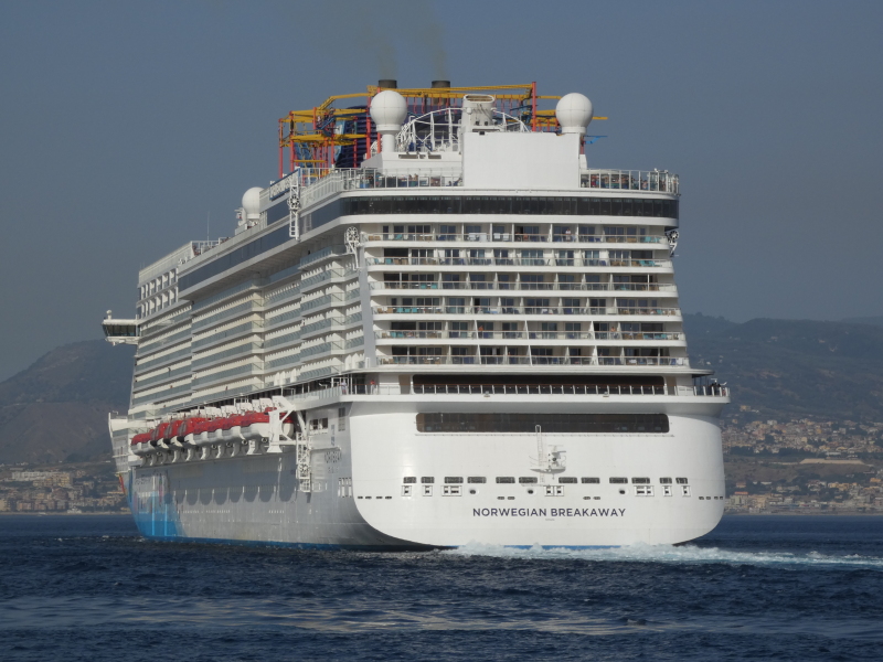
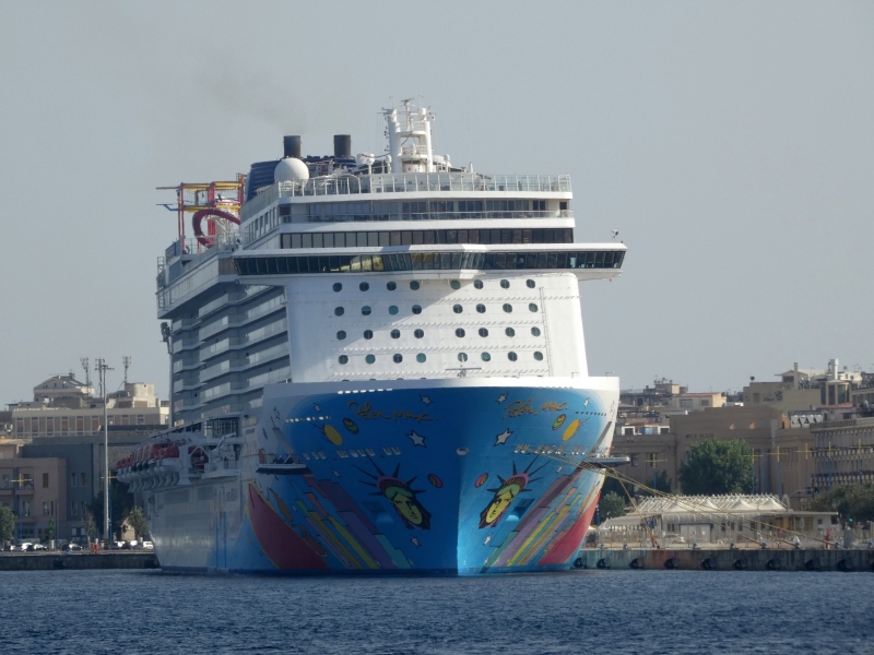
NORWEGIAN BREAKAWAY - IMO 9606912

Ship
2,74113
FavoriteComment
More
Full Screen
Exfir Data
Download Photo

Photo
details

Photographer:
Finn Tornquist [ View profile ]
Captured:
May 12, 2013
Added:
May 13, 2013
Views:
2,741
Image Resolution:
2,816 x 1,872

Description:

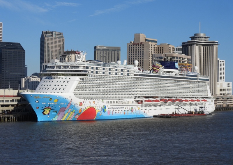
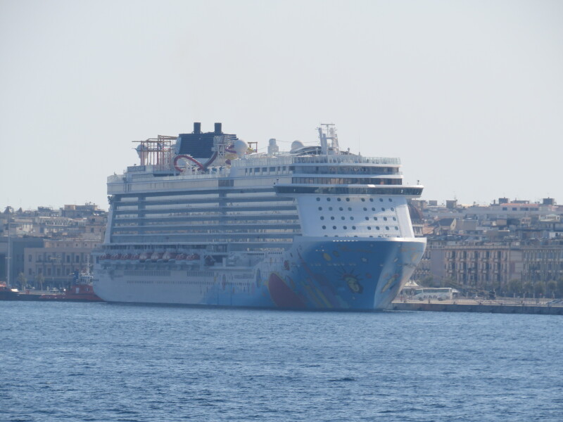
Leaving New York this evening, May 12, 2013, for Bermuda. Her first full length cruise. Shot taken from Ft. Wadsworth, Staten Island. The new Freedom Tower in Manhattan in the background.

Vessel
particulars

Current name:
NORWEGIAN BREAKAWAY
Current flag:
Bahamas
Home port:
Nassau
Vessel Type:
Passenger (cruise) Ship
Gross tonnage:
145,655 tons
Summer DWT:
11,000 tons
Length:
325.65 m
Beam:
39.7 m
Draught:
8.6 m

AIS Position
of this ship

Last known position:
18°24’36.08” N, 64°35’50.35” W
Status:
Speed, course (heading):
7.5kts, 99.8° (96°)
Destination:
 - Location:
Bonaiq Plt
 - Arrival:
Last update:
13 minutes ago
Source:
AIS (ShipXplorer)

Photo
Categories

This ship exists in the following categories:

Cruise Ships and Liners - 1 photos

Ship Interior - 1 photos

Ships under Repair or Conversion - 1 photos

Ship's Deck - 1 photos

Ships under Construction - 19 photos

Ships' Lifeboats and Tenders - 2 photos

Cruise Ships and Liners built 2011-2020 - 160 photos

Photographers
of this ship

(63)

COMMENT THIS PHOTO(13)

Newest First
person
Thanks for the kind comments, even though some of you don't like the ship. I like the ship, except for the graphics. It would be nice if they used graphics to help her looks.

Edit
comment

person
Even those Celebrity Solstice like cruisers look better.

Edit
comment

person
Stefan you are totally right about the funnel,i didnt notice.It looks atrophic!

Edit
comment

person
I think the whole design, for example the profile, is not good. Take ships with the similar size, for example: "Explorer of the Seas", "Liberty of the Seas", "Celebrity Solstice", and so on - they all look good.
I think the Breakaway design is a lack of creativity!

But the shot is nice!

Edit
comment

person
Very nice shot and great background.
I don't think the many bolconies are the worst on this liner. I think the funnel is an important mark on a ship and on this one you get copnfused with all the tubes around it. Very horrible in my opinion.

Edit
comment

person
Boring and monotonous.Another cruiser hit by the balcony virus.

Edit
comment

person
... oh, I'm sorry, Finn - forgot to say that it's an excellent photo. Personally I like these graphics a lot (but I don't care if they've been done by Peter Max or Paul Minimum...) :-)

Edit
comment

person
Cornelia, cruise shps with a bright red hull are nothing new... she even had that name: The Big Red Boat II (and yes, if I'm not mistaken, there's also been a Big Red Boat I) :-))
http://www.shipparade.com/az/Eugenio_C_1966/Big_Red_Boat_II_2005-04-13.jpg

Edit
comment

person
Graphics, well it is VERY unusual for me to see, but I am getting more and more used to them. The first shock with graphics on ship I received, when DFDS sold some of their really beautiful ferries to a Italian company Moby Lines which is known for giving their ships ugly Disney graphics all over, including funnels :o I think, we will get used to that. I am looking forward, when we see a cruiseship with bright red hull, I bet that does look great.

Edit
comment

person
Tend to agree not very stylish, but still quite a sight!

Edit
comment

person
I also think it's one of the most monotone and boring design for a cruise ship - even worse than Epic... :-(

Edit
comment

person
I'd rather have a monotone ship than those awful graphics. But I understand their reasons for having it. Peter Max is pop culture, not aesthetics.

Edit
comment

person
If not the graphics, this would have been the most monotone looking cruise ship so far.

Edit
comment