WELCOME TO SHIPSPOTTING.COM
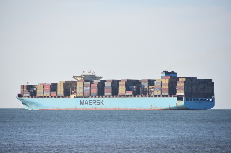
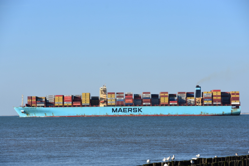
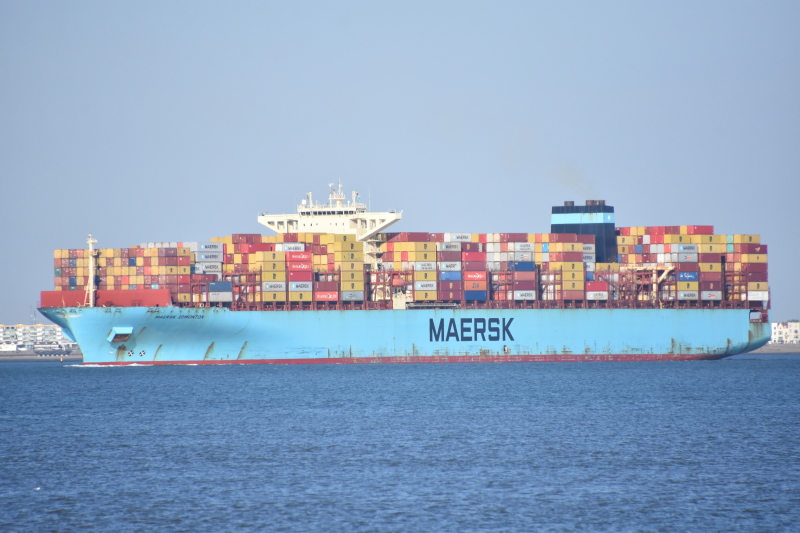
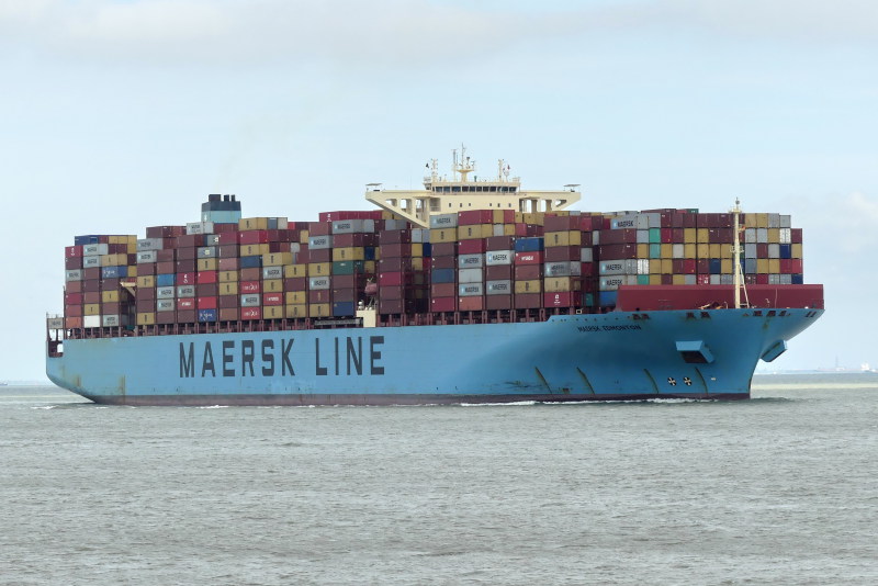
MAERSK EDMONTON - IMO 9458030

Photo
details
Description:
TAKING ARRIVING AT FELIXSTOWE ON HER MAIDEN VISIT 26/03/2011
BUILT: 2011 / HYUNDAI HEAVY INDUSTRIES, ULSAN
TONS: 141,716
FLAG: MARSHALL ISLANDS
OWNERS: RICKMERS SHIPMANAGEMENT
TEU'S: 13,092
LAUNCHED AS LEO RICKMERS
CALL SIGN: V7VO4
MMSI: 538004171
Vessel
particulars
Former name(s):
- Leo Rickmers (Until 2011 Feb)
AIS Position
of this ship
Photo
Categories
This ship exists in the following categories:
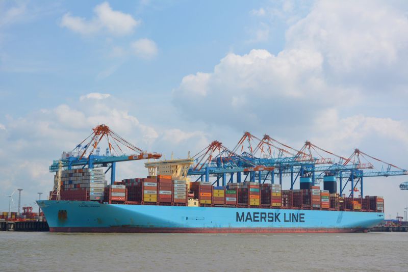
Containerships including more than one ship - 3 photos
Containerships built 2011-2020 - 113 photos
Photographers
of this ship
(45)
3 photos
2 photos
1 photos
4 photos
2 photos
2 photos
3 photos
1 photos
3 photos
4 photos
1 photos
2 photos
3 photos
Agustin Alapont Castilla (Tino)
5 photos
3 photos
1 photos
1 photos
2 photos
3 photos
1 photos
4 photos
1 photos
4 photos
8 photos
5 photos
2 photos
1 photos
1 photos
1 photos
2 photos
3 photos
1 photos
1 photos
2 photos
2 photos
6 photos
2 photos
3 photos
1 photos
1 photos
1 photos
1 photos
12 photos
1 photos
3 photos

COMMENT THIS PHOTO(5)
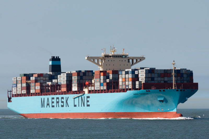
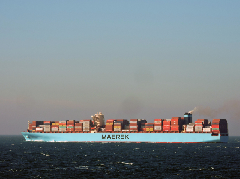
thats what i figured. APM really wants to make sure that everybody knows this big girl is a Maersk boat(as if the blue hull/tan house/black&blue funnel doesnt give it away, lol).
Edit
comment
That was very convenient for long-distance ship-spotters perched on the likes of the Dover cliffs!
Edit
comment
Anyone trying to read off ship names at long-distance with a scope or bins will tell you how difficult it can be to read tightly-spaced letters, even if they are reasonably large. Even at naked-eye distance, tight spacing can look smudgy and blocky. Therefore, the wider spacing is probably to make the logo more prominent.
Edit
comment
compare with: http://www.shipspotting.com/gallery/photo.php?lid=1242357
it looks funny to me this way. if they wanted the logo bigger why didnt they just size up the standard Maersk logo?
Edit
comment
Nice one, I had to take mine for futher away so they are not as good as this.
best regards
Derek
Edit
comment